Portfolio
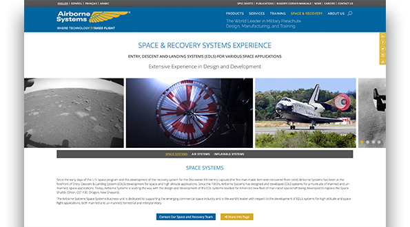
Client: Airborne Systems
airborne-sys.com
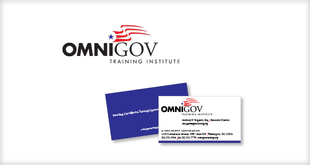
Client: OmniGov Training Institute Logo
Type of Work:
Logos and Identities
Industry:
Government, Law Firms
The OmniGov Training Institute was created to provide formal training programs to federal government workers on various legal issues.
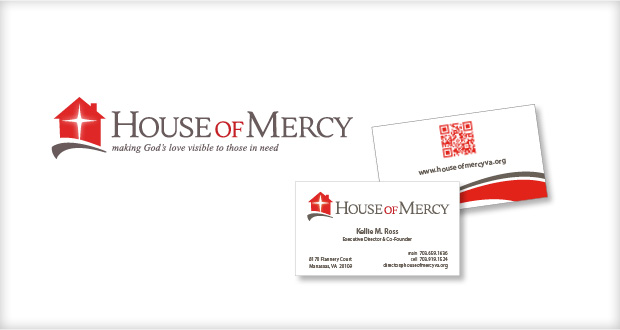
Client: House of Mercy Identity
Type of Work:
Logos and Identities
Industry:
Non-Profits
The House of Mercy provides food, clothing, and financial assistance to the poorest in their community. Their thrift store generates income to fund their programs, while their food pantry feeds the hungry.
This logo for the House of Mercy is full of meaning. The house represents the safe haven they are to those who need them, the gray swoosh represents the path they help their clients follow to self-reliance, and the star represents the ray of hope they provide through their acts of mercy.
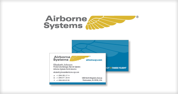
Client: Airborne Systems Logo
Type of Work:
Logos and Identities
Industry:
Military and Defense
Airborne Systems has a 100-year legacy in aviation and is the world’s most trusted resource for parachute design and manufacturing.
We updated the company’s logo to a more contemporary form. We kept the original wing, since that was the most recognizable part of their logo, and kept it the same color. The name is more readable and now in a more neutral gray.
Client: Paradise Stables Identity
Type of Work:
Logos and Identities
Industry:
Museums
Paradise Stables is a 125-acre horse farm in Frederick, Maryland offering boarding, training and breeding services. The stables themselves were built by Amish builders and feature many modern amenities for the care of the horses, and the convenience of the riders and trainers.
In order to depict the grandeur and character of the property we used scratchboard illustration to create a classic-looking image that could easily be reproduced in one or two colors, making it suitable for screen printing and black and white ads.
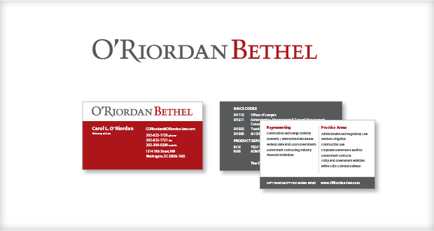
Client: O’Riordan Bethel Identity
Type of Work:
Logos and Identities
Industry:
Law Firms
The O’Riordan Bethel law firm represents commercial businesses, not-for-profit organizations, financial institutions, and individuals.
This two-color “type treatment” strikes a balance for the two names and sets a professional, but bold color scheme.
The client’s fold-over business cards include a list of practice areas and NAICS codes on the back.
Client: Talbert & Eitel Identity
Type of Work:
Logos and Identities
Industry:
Law Firms
Logo development and design of a business card, stationery, tabletop display and electronic letterhead.
Client: Historic Tredegar Identity
Type of Work:
Logos and Identities
Industry:
Museums
Historic Tredegar is an important landmark in Richmond, VA and played a critical role in the Civil War – providing cannons and other iron products to the South. Although some of the buildings remain today, much of the site is in ruins, including the iconic archway that stands in the courtyard.
This logo combines memorable imagery of the site itself with an icon that serves as a reminder of the iron industry and the civil war—the cannon.
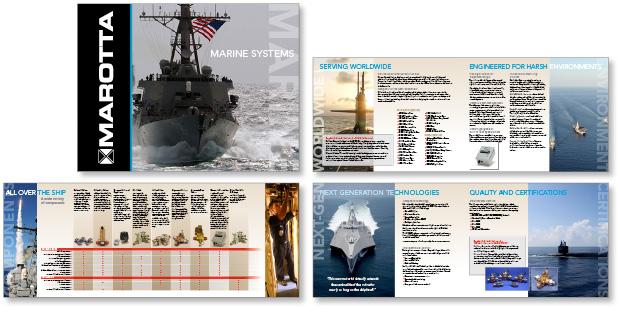
Client: Marotta Controls Marine Products Brochure
Type of Work:
Brochures
Industry:
Military and Defense
Marotta Controls designs, develops and manufactures precision control solutions for Defense, Aerospace, Space and Commercial applications. This brochure was developed specifically for their marine industry clients.
Work included developing the brochure concept, copywriting, image research, design and layout.
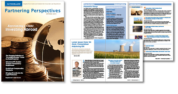
Client: Sutherland | Partnering Perspectives Magazine Template
Type of Work:
Templates
Industry:
Law Firms
In addition to its vast online resources, Sutherland publishes a quarterly print magazine called Partnering Perspectives, which offers insights on the challenges and opportunities presented by the growth of internet, mobile and wireless technologies.
This magazine design and template was designed to allow the firm’s in-house staff to produce future issues using InDesign. The template included all the unique elements of the magazine. We also wrote and designed a guide to using the template.
This project was a Knapp Marketing team project.
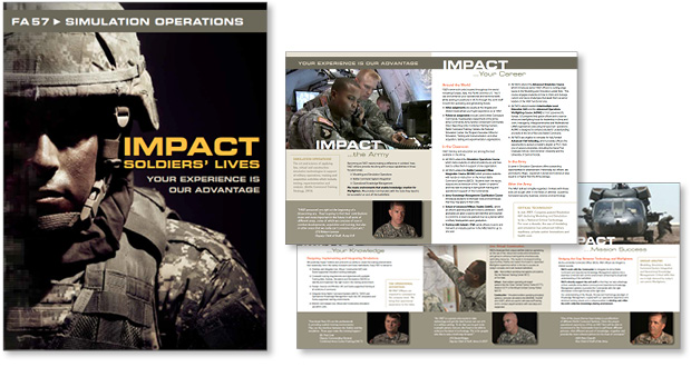
Client: U.S. Army Brochure
Type of Work:
Brochures
Industry:
Military and Defense
FA57 is the Army’s designation for simulation operations officers. This brochure makes the case for choosing FA57 as a career path.
Design began with the development of a logo and custom cover photo-illustration blending soldier with technology.
Work included developing the concept and approach, copywriting, design and print management.
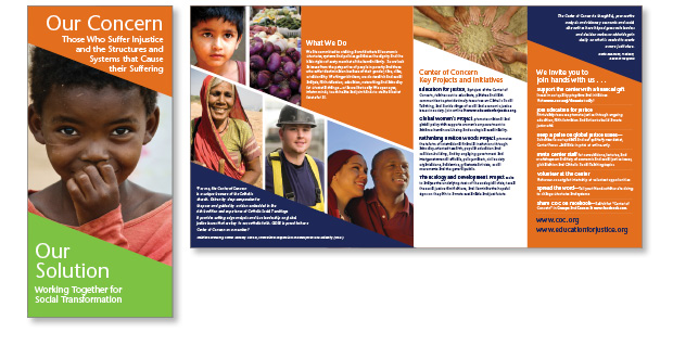
Client: Center of Concern Brochure
Type of Work:
Brochures
Industry:
Non-Profits
The Center of Concern is a Catholic social teaching organization that motivates change through educating the public, educational institutions and governments.
This double-parallel-fold brochure presents a concise description of the organization’s mission using facts and images, and is highlighted with testimonials.
Client: Center of Concern Ads
Type of Work:
Ads
Industry:
Non-Profits
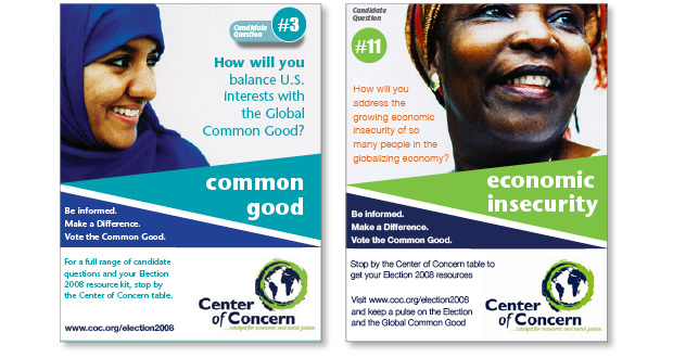
The Center of Concern is a Catholic social teaching organization that motivates change through educating the public, educational institutions and governments. These two quarter page ads raise awareness for specific issues and at the same time allude to their being only part of the conversation.
Client: O’Riordan Bethel
Type of Work:
Brochures
Industry:
Law Firms
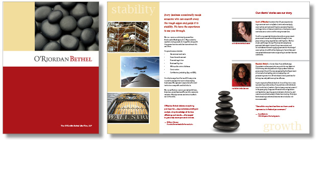
O’Riordan Bethel is a law firm in Washington, DC. This project included development of a logo and color scheme to establish the firm’s identity in addition to design and print of a 4-page brochure. We used the visual imagery of the river rocks to add texture and convey their message of stability and growth.
Client: Marotta Systems
Type of Work:
Marotta, Military and Defense, Displays, Exhibits and Signs
Industry:
Military and Defense
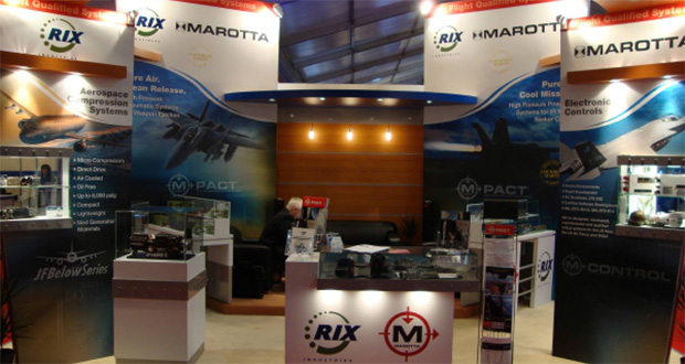
Marotta Controls designs, develops and manufactures precision control solutions for Defense, Aerospace, Space and Commercial applications.
We designed these four large graphic panels for an exhibit booth featuring jet fighters that rely on Marotta Controls products.

